Why the Healthcare.gov Insurance Exchange Bombed
Policy Makers Insisted on a Customer-Unfriendly Workflow
Here’s our analysis of what went wrong in the design and launch of the U.S. government’s Health Insurance Exchange. Without getting into contractor finger-pointing or technical details, we focus on HOW customers want to reach their goal: get affordable health insurance for me and my family. They want to explore options, see trade-offs, then find out what subsidies they are eligible for, and then apply. Healthcare.gov implemented that scenario in reverse.
NETTING IT OUT
One of the biggest snafu’s in website design has been the spectacular early failure of the U.S. government’s touted national health insurance exchange, known as Healthcare.gov. The site went live on October 1, 2013 amid much fanfare, but quickly proved impossible to use due to sluggish response times, long waits, and customer registration information that had to be re-entered over and over again. This phenomenally bad website launch has damaged the reputation of President Barack Obama and his Democratic party and adversely impacted the adoption rates of health insurance policies for non-insured Americans.
We believe that, in addition to technical and scalability issues, the biggest culprit was the non-consumer-friendly design of the national healthcare.gov site. Instead of letting consumers browse anonymously, policy-makers decided that they should first register and apply for eligibility for government subsidies before they would be able to see the details of the health insurance plans’ coverage, deductibles, and pricing. The result? Millions of consumers have been forced to apply for health insurance subsidies prematurely when all they really want is to see what health insurance plans are available to them.
Original Healthcare.gov Site Design
© 2013 Healthcare.gov
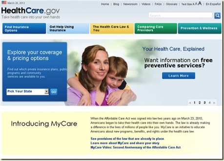
1. In an earlier version of the national Health Insurance Exchange, the emphasis for the user interface was to show customers what health insurance plans and pricing options would be available to them. (This beta screen is dated March 26, 2012.) The site that launched on October 1st, 2013 looked quite different.
ORIGINAL DESIGN PRESUMED THAT CONSUMERS WOULD SHOP FIRST, THEN ENROLL
The original design of the U.S. national Health Insurance Exchange, healthcare.gov, wasn’t bad. Consumers were supposed to be able either to see health insurance plans and non-subsidized pricing, and/or to begin the application process, find out what subsidy they were eligible for, and then select a health insurance plan based on the actual price they would pay for monthly premiums.
Remain Anonymous, See the Options in My State, and Get Ballpark Pricing. According to the original site design, health insurance customers were supposed to be able to specify their state of residence, pick an age range, income range, and family size and then browse the insurance plans that were available to them. The user interface was clean. The information was easy to understand and to navigate. You were supposed to be able to compare and contrast options—all before logging in.
Register to Apply for Subsidy and Buy Insurance. Then, once you found the plan that looked right for you and your family, you could then apply and find out whether or not you were eligible for a subsidy that would reduce the cost of your health insurance premiums. That was the original design. The healthcare.gov website’s back-end engine would verify your identity and then would validate your income, your family members’ details (social security numbers, ages, incomes), and other personal information. The application process was designed to integrate into the IRS, Social Security, and a myriad of other government and commercial systems. These systems could check to see whether the information you provided matched their records. We presume that nobody assumed that everything would line up exactly, but that there would need to be some interactions, validation, and updating over a couple of days in order to finalize the matching up of peoples’ information and the determination of what subsidies, if any, they’re actually eligible for.
Finding Insurance Options (Without Logging In) Was Part of the Original Design
© 2013 Healthcare.gov
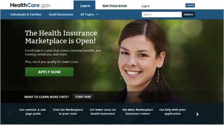
3. This is the site that went live on October 1st, 2013. Note that it promotes enrolling and applying first. The “Want to Learn More First? Start Here option was supposed to enable consumers to see the plans in their state with representative list prices based on age and family size. But just before launch, the decision was made NOT to allow consumers to browse plans anonymously. You had to register first.
BY THE TIME OF LAUNCH, THE DOMINANT WORKFLOW HAD SHIFTED
Primary Workflow at Launch: Apply First; See Prices Later
However, in the year-long run-up to the October 1st, 2013 launch of healthcare.gov, the priorities shifted from letting customers browse plans and see list prices to focusing on getting customers to sign up to see what subsidies they were eligible for. That decision violated a well-known principle of user experience design: Let people see and appreciate what’s on offer before you ask them to identify themselves.
Consumers’ Difficulties with the Site Required Rapid Evolution
© 2013 Healthcare.gov
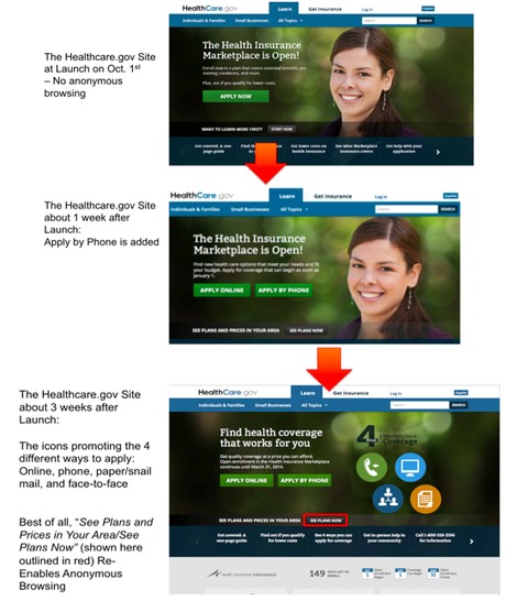
7. Because the healthcare.gov website was so hard to use, the first thing the website team had to do was to add more phone support. Then they removed the smiling lady’s face and emphasized all the different ways you could apply.
Any experienced e-commerce website designer knows that you want to make it as easy as possible for prospective customers to see what’s on offer and only ask them to provide their personal details when they’re committed and ready to purchase. And, even then, shopping cart abandonment is a big problem. As soon as you ask for the commitment of providing addresses and credit card numbers, people will hesitate and often bail out.
In the case of healthcare.gov, the purchase process is particularly baroque because you need to prove that you are eligible for a government subsidy before receiving the actual price you’ll be paying. Fair enough. That’s the law.
The BIG mistake was to insist that...(more)
(Download the PDF to read the entire article.)


